
Build Your Brand — 03. How I Build a Brand Color Palette

In this “Build Your Brand” series of blog posts, I’m pulling back the curtain for those interested in learning more about the nuts and bolts of brand design. If you are an entrepreneur who is DIY-ing your own brand, if you are curious about fundamental design principles and terminology, or could just use a Design 101 refresher, read on for some helpful tips on how to make meaningful, strategic decisions when it comes to the visuals you use to promote your biz.

BUILD A MOOD BOARD
The first thing I do when building out a color palette for a new brand is pull some inspiring images together into a cohesive mood board. My favorite sources for royalty-free inspiration images are Unsplash and Pexels : the images are high quality and are completely free for commercial use. I usually aim for a mix of textures, lifestyle, interior and still life images, and I play around with the selection until it feels complete. For this brand, I knew I wanted to go for a mix of earthy textures and airy tones.
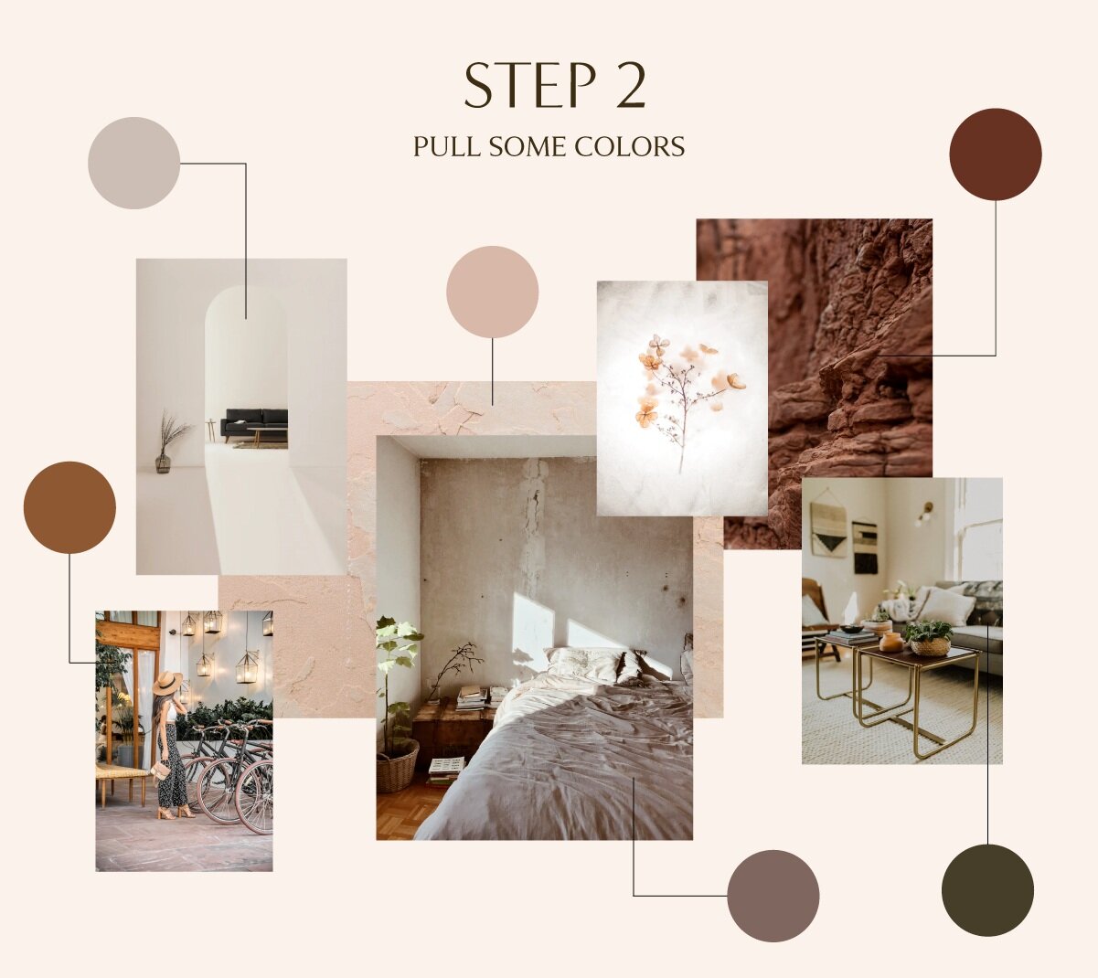
PULL SOME INITIAL COLORS
I use the color picker tool in Adobe Illustrator to select some colors directly from the inspiration mood board. I find this method super quick and way easier than choosing colors by sight. I try to go for a mix of lights and darks so that I have enough variety to work with in the next few steps.
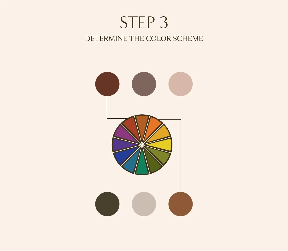
USE THE COLOR WHEEL
At this point, I lay out my colors and consider their relationships on the color wheel. (If you missed my post on using the color wheel to determine color relationships, check it out here!) The red and orange tones in this palette are roughly analogous, meaning they are adjacent to one another on the color wheel. This assures me that this palette will feel stable, calm and harmonious, and the warmth of the overall palette is very welcoming, which is in-line with the brand’s overall tone. If I don’t feel good about the way my selected colors are working together, I just go back to Step 2 and choose some new ones.

ASSIGNING a Color Heirarchy
At this point, I try to decide on a “Main Color” for the brand and assign the roles of accents and neutrals to the others. In this case, I chose the deep orange as the main color. Some brands will have more neutrals, and some will have a larger variety of accents, but I always have at least one dark neutral and one light neutral (even if that neutral is pure white) to ensure the palette will be flexible enough to use in all applications. I usually also do some tweaking to the colors at this point, making a color lighter or darker to ensure it can preform it’s assigned role in relation to the others.

TEST. TEST. TEST.
At this stage, if I’m feeling pretty good about the colors, I’ll go ahead and take them for a spin. I typically try laying out the colors proportionally as I have above, to see if the balance feels good and the color assignments will work as intended. I’ll try the colors in transparency to see how they look layered over one another. I’ll also test out existing brand elements and logos in the palette, and even try popping the colors into a dummy web page to see how the text reads. I’ll continue tweaking as needed until I’m satisfied with how the colors interact.

THE FINAL STEP: NAME THE COLORS
This is my favorite part of building a brand color palette! I love giving descriptive names to each color because it helps connect the choices back to the larger brand narrative and strategy. Above, I choose some earthy, nature-inspired colors for this brand. This also makes it easier for the client to reference a particular color when using their brand assets later on. Instead of constantly repeating “No, the OTHER light grey” they can just call the color by it’s name to avoid confusion.
NEXT POST: TYPOGRAPHY 101
Now that I’ve covered in-depth how to select and use colors in your brand (make sure to check out the posts on the color wheel and color psychology if you haven’t already), I’ll be moving onto another exciting element of your brand: fonts and typography. I’ll share how I make decisions on what types of fonts to use and how to implement them in your brand to get people to pay attention to what you are saying!